Spec redesign for VIA Italian Table by Jeremy Anderson · photos are placeholders for VIA's own Brand book Logos Layouts
Book a table

Layout variations

Four ways to open VIA's homepage, all in the same poster world and all with the same working actions: book on Resy, order takeout or delivery, plan an event. Only the first screen changes; the wall, rooms, awards and hours follow underneath. Each one is a full working page.

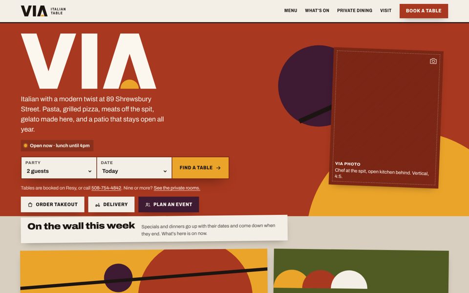
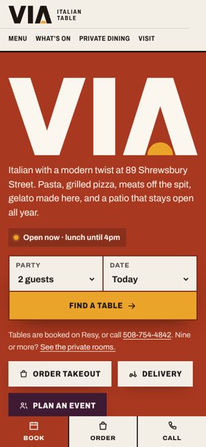
Layout A at desktop size: a brick-red lead poster with the VIA wordmark, booking strip and three doors, with the poster wall peeking in below.

Lead poster

Layout A · the current homepage

Live now

One big brick-red poster carries the wordmark at full size, the live open/closed status and the booking strip. The next posters on the wall peek in under it.

Leads with
The brand, then booking.
Best for
A first impression that makes the new identity unmistakable.
Trade-off
What's on this week sits one scroll down.
Open layout A
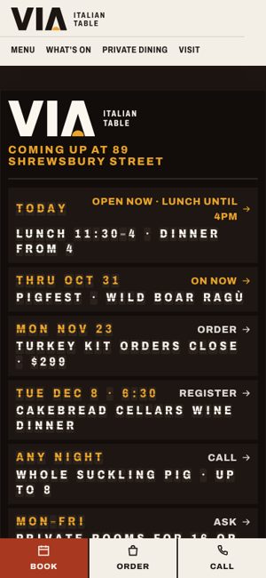
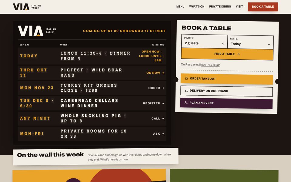
Layout B at desktop size: a dark split-flap departures board listing today's hours, PigFest, the turkey kit, the Cakebread dinner and more, with a paper ticket for booking.

Par­tenze

Layout B · departures board

What's coming up at VIA as an Italian railway departures board: today's hours, then each dated special, dinner and offer with its status. The letters flip into place once on arrival. Booking is a paper ticket beside the board.

Leads with
What's on, in date order, then booking.
Best for
Regulars who come back to see what's next.
Trade-off
The darkest and busiest opening; the wordmark is smaller.
Open layout B
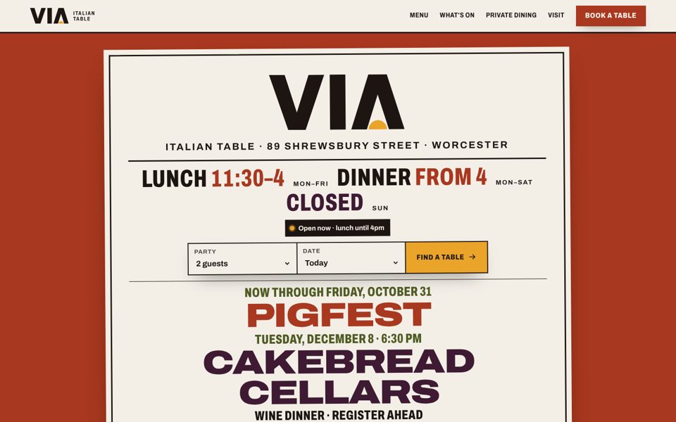
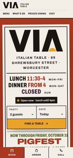
Layout C at desktop size: a single paper playbill on a brick-red field with VIA, the hours in condensed type, the booking strip, and PigFest and Cakebread Cellars set large.

Mani­festo

Layout C · typographic playbill

The whole first screen is one paper playbill, set the way wood-type posters were: hours, the booking strip and the two headline events in mixed widths and three inks. No pictures needed.

Leads with
Hours and booking, then the two big dates.
Best for
Launching before VIA's new photography exists.
Trade-off
It leans on type alone; the playbill needs editing as events change.
Open layout C
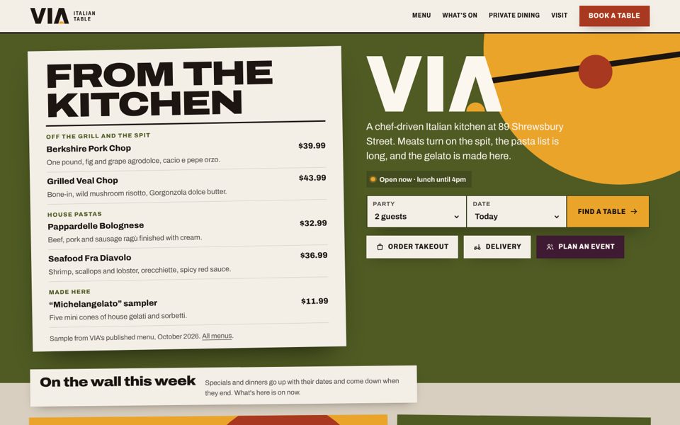
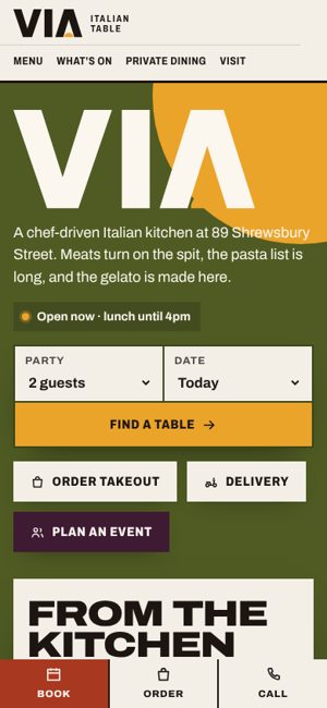
Layout D at desktop size: an olive field with a tilted paper menu of signature dishes and prices on the left, and the wordmark, booking strip and doors on the right.

Cucina

Layout D · kitchen first

The kitchen leads: a paper menu sheet with dishes from the grill, the spit and the pasta list, with VIA's published prices, beside the wordmark and booking strip. The spit crosses the corner of the poster.

Leads with
Food and prices, then booking.
Best for
First-time visitors deciding whether VIA is for tonight.
Trade-off
Prices on the front page need updating whenever the menu changes.
Open layout D

The same in all four

Working actions

The Resy booking strip, takeout, delivery and the event route are on the first screen of every layout, plus the Book · Order · Call bar on phones.

The wall below

Dated posters that come down when they end, then private rooms, awards and hours, shared from one source.

Any logo

The logo menu in the proposal bar swaps all eight marks (the seven concepts on the logo page and VIA's gold mark) on every layout.