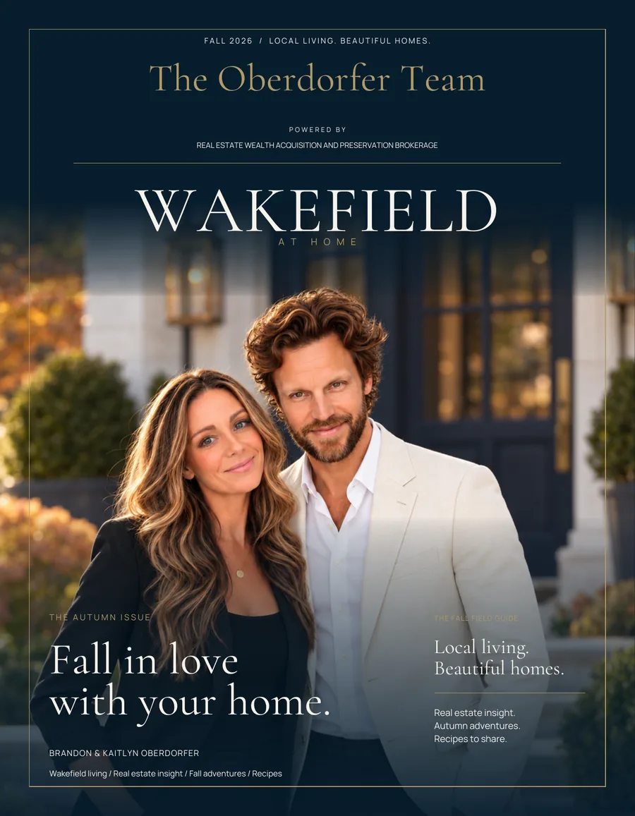
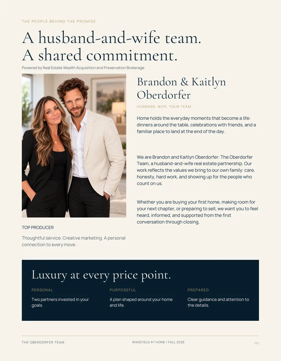
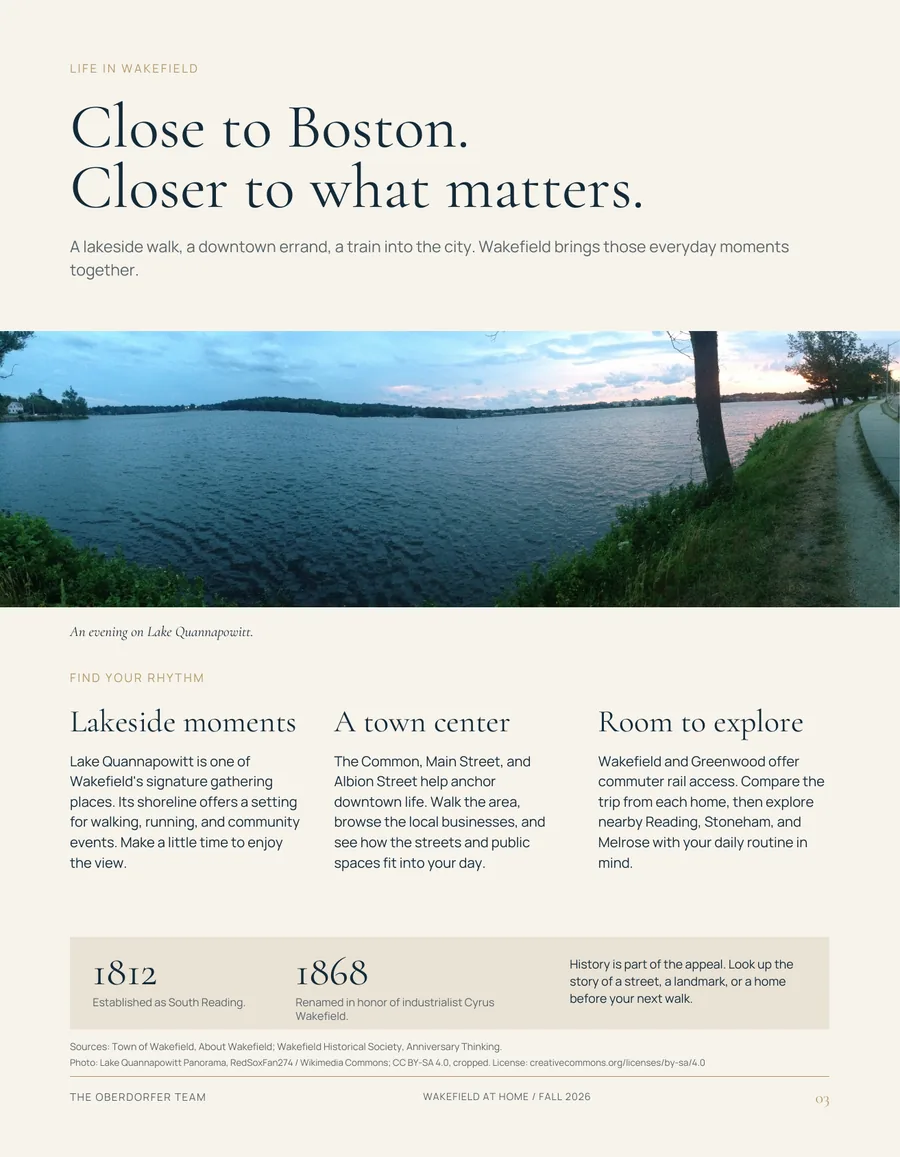
| Typography | Cormorant Garamond Light for every headline, often as two short lines. Light Italic for captions and the answering half. Manrope ExtraLight for text, with widely tracked caps for labels. | Same faces. Light display from 30px up. Text raised to Regular for screens. Labels in 600, tracked 0.18em. |
|---|
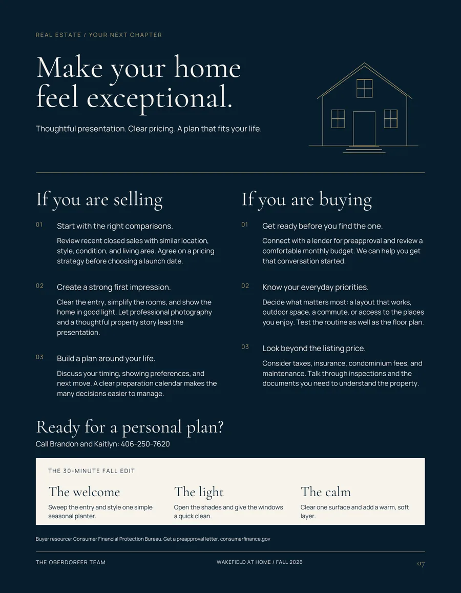
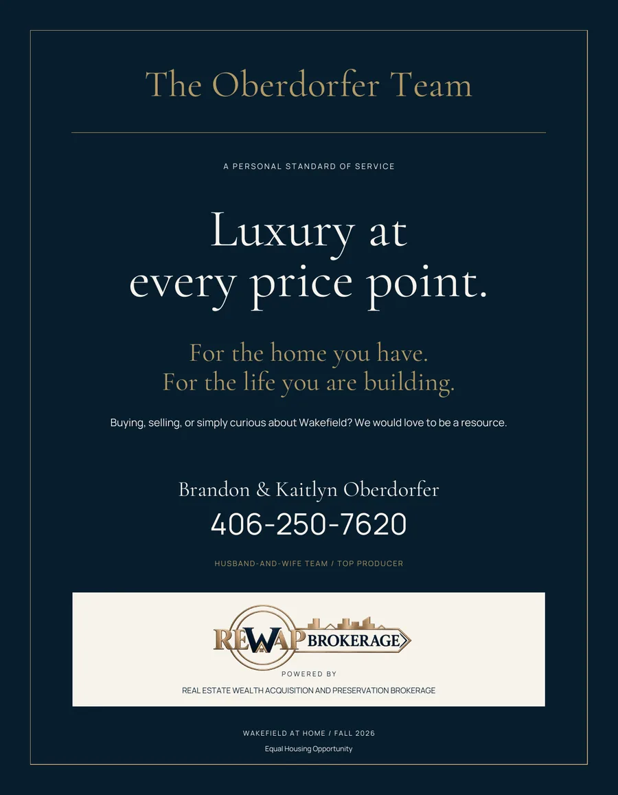
| Color | Navy and ivory alternate by page (navy on 1, 7 and 8, plus the 2 and 4 panels). Gold appears only as lines, labels and the wordmark. A sandstone band on page 3. | Sampled tokens, Gold Ink for accessible text, semantic remapping for navy sections. |
|---|
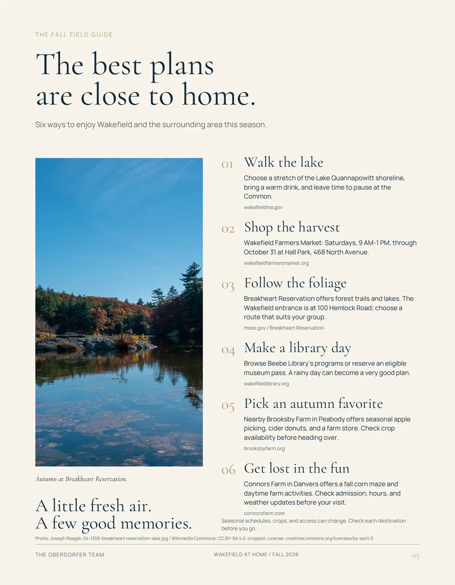
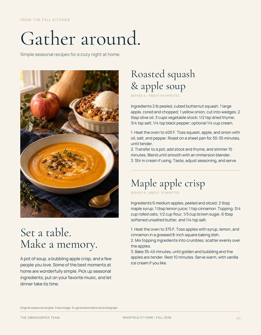
| Grid | About 0.6 in margins, a 3-column body grid (pages 3, 4, 7), and image/text splits of about 40/60 (pages 2, 5, 6). | A 12-column grid. The 3-column triad becomes 4 + 4 + 4. Splits become 6 + 5 offsets. |
|---|
| Image composition | Full bleed on the cover, a framed rectangle elsewhere, never rounded. Panoramic landscape on page 3, tall portrait crops on pages 2, 5 and 6. | Square corners. Ratio set: 16:9, 4:5, 4:3, 3:4, 3:2, 9:16. |
|---|
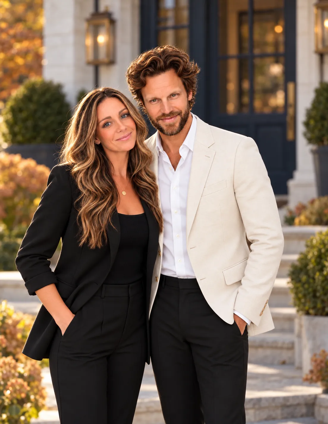
| Photography | Warm, natural light. Autumn palette. People shown as a couple, not as stock. Credited sources. | Art direction guide with favor and avoid rules, and licensing and AI-image rules. |
|---|
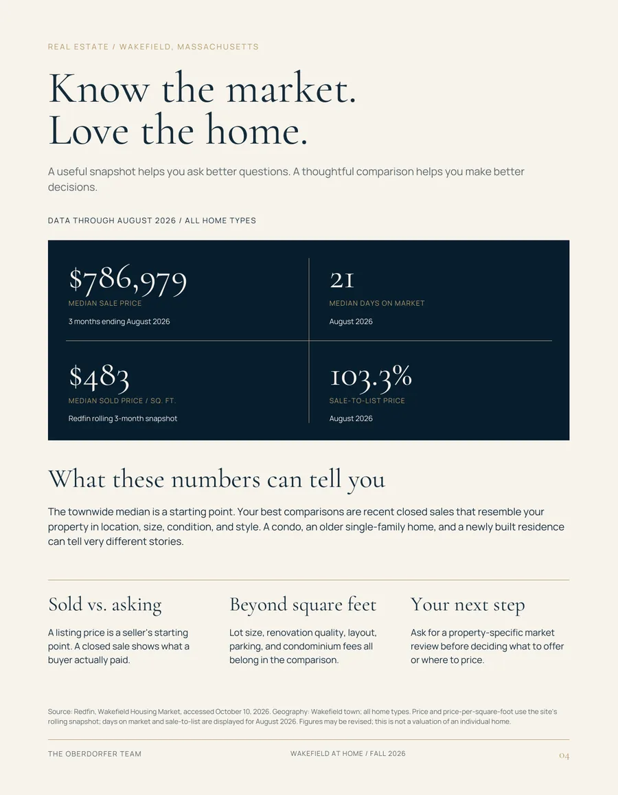
| Spacing | Generous top margins, headline space at about 1.5× body text. Dense text columns balanced by quiet bands. | 4px scale with editorial jumps. Section rhythm of 64–136px. |
|---|
| Hierarchy | Running head → headline → lead → body → source line → folio. Consistent on every page. | Chapter and section components, folio bar, source-line style. |
|---|
| Decoration | The inset hairline frame (pages 1, 8), gold rules, and the page 7 house drawing. Nothing else. | The folio frame, gold rule, dimension rule, and the line-illustration family. |
|---|
| Consistency | High. Every page shares the running head, folio and type pairing. One technical gap: the file also references Helvetica, which is not embedded, for one text object. | Brand-wide font rules. Helvetica is not used. |
|---|